Internal design debates frequently delay product roadmaps in iGaming organizations. Product managers, designers, and commercial executives spend hours arguing about aesthetic choices. They debate the color of a deposit button, the layout of a sports betting slip, or the density of a casino lobby. These discussions are typically led by subjective style opinions or the highest-paid person's preference. This is a costly operational distraction. Subjective debates do not improve conversion rates, protect player retention, or increase net gaming revenue (NGR). To accelerate your product development cycle and optimize player value, you must replace opinion with structured benchmarking. Usability is not a matter of taste. It is an objective measure of how easily players navigate, understand, and interact with your product. By applying classic usability heuristics to your digital interfaces, you can eliminate subjective design debates and align your team on a data-backed product roadmap. The primary goal of usability optimization in online gaming is to establish and protect the player's flow state. In this state of focused engagement, the interface becomes invisible, allowing the player to focus entirely on their entertainment. Any cognitive friction, no matter how minor, breaks this flow state, causing players to log out and switch to a competitor.
Applying Usability Heuristics to iGaming Lobbies and Betslips
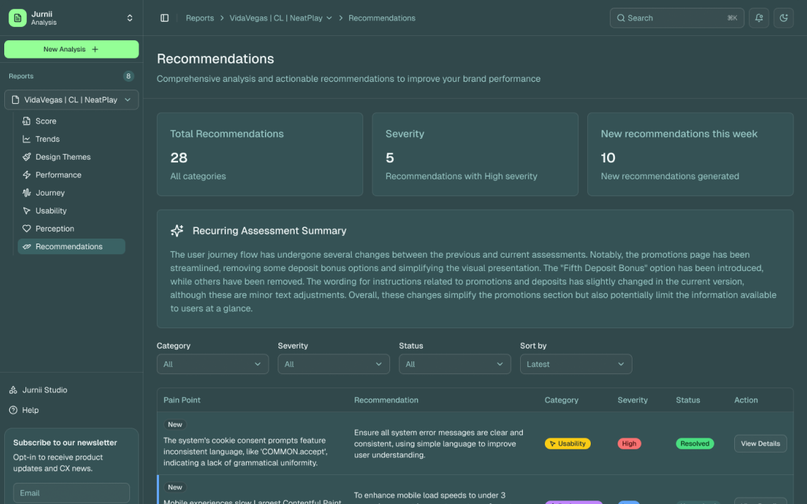
Traditional design reviews are structurally flawed because they rely on gut feel. A designer argues that a layout feels clean. A commercial director argues that it needs more promotional banners. A developer argues that the current layout is easier to implement. Without an objective framework, these debates end in gridlock or compromise, resulting in a cluttered interface that serves nobody. Structured heuristic analysis resolves this gridlock. By evaluating your user interfaces against established usability criteria, you replace subjective opinions with structured evidence. Jurnii UX formalizes this process by running a deep structural analysis across four key dimensions: Journey Effectiveness, Usability, Performance, and Perception. Under the Usability category, Jurnii replaces internal bias with proprietary benchmarking. We evaluate your product against 70+ ranked usability recommendations, comparing your performance directly against your top competitors. This structured approach translates design choices into commercial impact. We do not say an interface feels confusing. We show that a specific menu structure violates usability standards and scores 42/100, causing a measurable drop-off in active players. This objective data aligns the product team, allowing them to prioritize optimizations based on conversion impact rather than executive opinion.
Visibility of System Status: The Betslip and Live Trading
The first usability heuristic is the visibility of system status. The interface must always keep the user informed about what is happening, in reasonable time, through appropriate feedback. In iGaming, this visibility is most critical in sports betting, particularly during live, in-play events when odds change in milliseconds. Many operators handle odds changes poorly. When a player attempts to place a bet, the backend system processes the transaction. If the odds shift during this processing window, the system rejects the bet. The interface displays a generic error message, clears the selection, and forces the player to start the journey again. This is a severe usability failure. It violates the visibility of system status by failing to explain why the bet was rejected. It also breaks the player's flow state, causing immediate frustration. The correct usability pattern is to provide real-time, contextual feedback. If the odds change while a bet is in the slip, the interface must highlight the change immediately. Use clear, color-coded indicators to show whether the odds have increased or decreased. Display the updated potential return clearly, and present a single-tap option to accept the new odds and submit the bet. This keeps the player informed and maintains their momentum. It prevents the frustration of rejected transactions, protecting your active sports betting volume and reducing betslip abandonment.
Match Between System and the Real World: Lobbies and Category Architecture
The second usability heuristic requires a close match between the system and the real world. The interface must speak the user's language, using words, phrases, and concepts familiar to the player rather than internal technical terms. In iGaming, this match controls how you design lobbies and category architecture. Many operators structure their casino lobbies based on backend game categories or vendor definitions. They present players with menus like "Proprietary Slots," "Aggregation Feed B," or "Third-Party Table Games." These terms mean nothing to a player. They are internal, operational labels. To optimize usability, your category architecture must align with the player's mental model. Group games by themes, mechanics, or features that players understand, such as "Megaways," "Bonus Buy," or "Classic Fruits." The same rule applies to search and navigation. If a player searches for "blackjack," the system must display all relevant blackjack tables immediately, categorized by minimum bet limits and availability. It should not return a raw list of technical game IDs or a blank screen due to a minor typing error. A typo-tolerant, predictive search function ensures that the system matches the player's intent, maintaining their momentum and keeping them in the flow.
Consistency and Standards: Transactional Interface Conventions
The third usability heuristic is consistency and standards. Players spend most of their time on other digital products, from banking apps to social media platforms. They expect your interface to follow the same conventions and standards. As Jurnii’s market data shows, 70% to 80% of UK players hold 3 to 5 active operator accounts simultaneously. They move between different betting apps daily. If your product violates industry standards, you increase the cognitive load required to use your application. For example, players expect the betslip on a mobile device to be accessible from the bottom navigation bar or a persistent floating button. They expect the deposit button to be located in the top-right corner of the screen. They expect the search icon to be represented by a magnifying glass. If you decide to place the deposit function inside a sub-menu to make the homepage look cleaner, or if you rename the betslip to "My Selections," you break consistency. Players must actively search for basic functions, causing frustration and session abandonment. Maintain strict consistency across all transactional interfaces. Use standard icons, place navigation elements where players expect them, and follow established B2C transactional patterns. This reduces the learning curve for new players, ensuring they can place their first bet or make their first deposit without hesitation.
Error Prevention and Recovery: KYC and Deposit Inputs
The fourth usability heuristic is error prevention. Even better than good error messages is a careful design that prevents a problem from occurring in the first place. This is highly critical in registration and deposit funnels, where entering incorrect information can block the user journey entirely. Many operators use forms that only validate inputs after the user clicks the submit button. A player fills out their name, address, date of birth, and phone number, only to be presented with a list of red error messages because they formatted their phone number incorrectly or omitted a required field. This is a reactive approach to error handling that kills conversion. A proactive usability pattern uses inline validation. As the player types, the interface verifies the format of the input in real-time. If a phone number is missing a digit, or if a password does not meet the security criteria, the system displays a clear, helpful hint immediately. Use address lookup APIs that auto-complete the player's address as they type their postcode. This prevents spelling mistakes that can trigger false positives in background KYC checks. If an error does occur, the error message must be written in clear, non-technical language. It must explain exactly what went wrong and how the player can resolve it. Do not display raw database codes or generic messages like "Registration failed." Tell the player which field needs correction and why, allowing them to recover quickly and complete their journey.
Evidence-Based Roadmaps: Resolving Roadmap Gridlock
Usability benchmarking does more than just solve immediate interface issues. It builds a systematic process for product optimization. By replacing subjective design opinions with structured heuristic criteria, you align your product team and speed up your development cycle. You no longer waste time in meetings debating design preferences. Instead, you analyze your Jurnii UX scores, identify the usability gaps that cost you conversion, and prioritize your roadmap based on objective evidence. This is how you build a durable experience advantage. By continuously auditing your player journeys against usability heuristics, you remove the micro-friction points that cause player defection. You protect your active player base, increase your registration-to-deposit conversion rate, and maximize player lifetime value. Base your roadmap on evidence, not opinion. Benchmark. Act. Outperform.